About My Senior Project
Lately, a new racial label for Latinos and Hispanics is being used, which is ‘Latinx’. Among the people that it is intended to describe, few have heard of the term—let alone use it. About or less than 3% actually use it. ‘Latinx’ is just another term that has been added to the list. “Latine’, which is a new term that has emerged, mainly in Latin America, but has been slowly replacing ‘Latinx’ here in the United States.
The problem is that the term ‘Latinx’ is another social label given to Latinos and Hispanics, we were not asked if that is how we wanted to be identified as. But it’s not just these social labels, other misconceptions have created faulty information and discrimination towards Latinos in the United States. The solution that I came up with is to create a book that educates individuals on the issue, defines the differences of each pan-ethnic label, and to correct the misconceptions of Latinos.
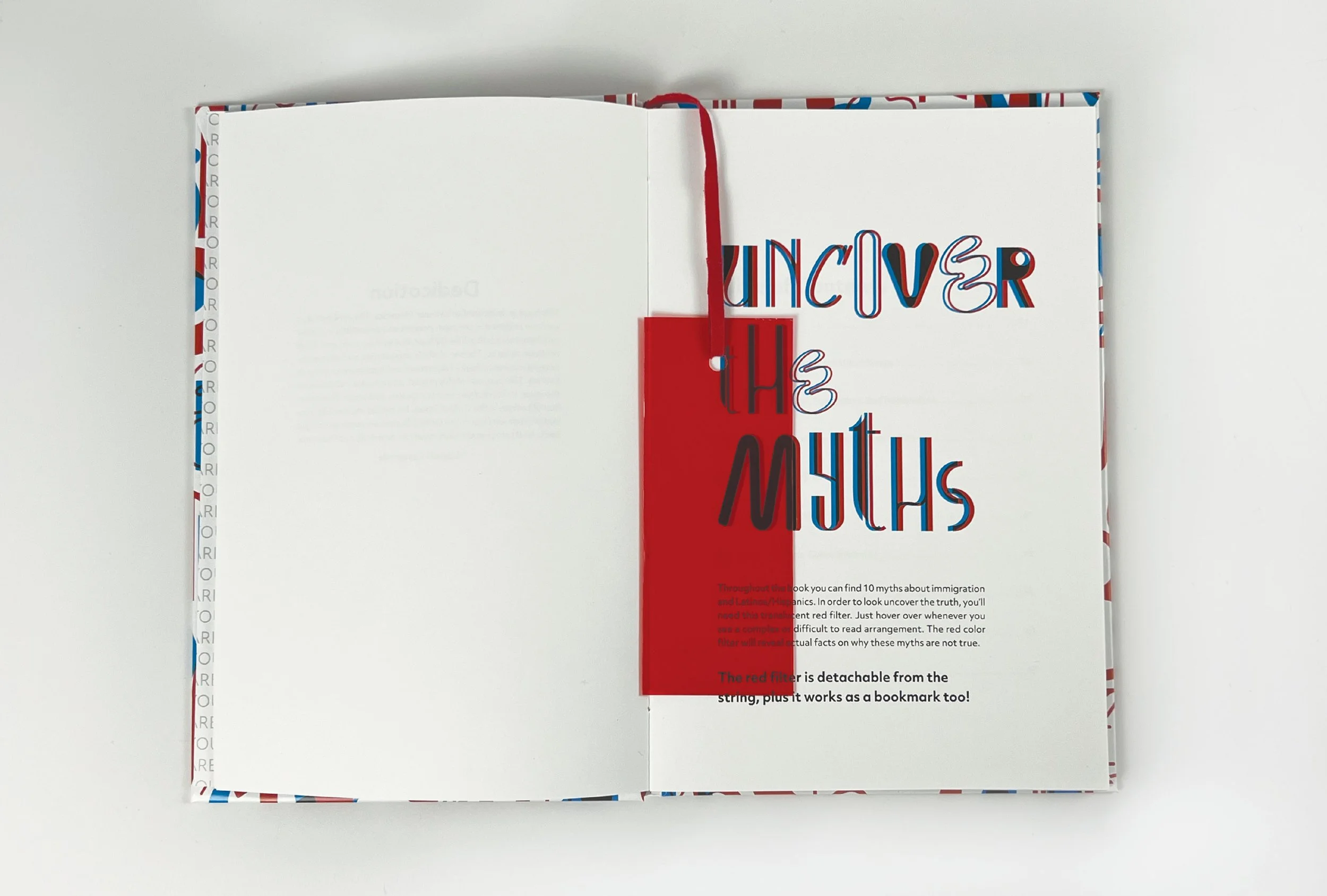
You are/We are, 2022, Cover and Sleeve, Book Publication
What You Can’t See, Doesn’t Mean There Isn’t Anything There
For this project, I wanted to do this anaglyph 3D art effect within my book. Oftentimes, we misjudge or don't do our research on whether or not these myths or misconceptions are true or not. It is up to the individual to take that extra step and look behind these myths. In order for them to do so, a red transparent filter is provided in the book so that they can uncover the myths.
In the end, the purpose of this book is to educate and inform people on the issue.
A quote from the book that I want everyone to take away from is…
“We need to be able to self-identify as we wish because nobody has the right to do that for someone else. And if that means that each of us identifies in a different way, then so be it.”
— You are/We are, chapter 7, page 55, 2022
Previous Student Work
-

tap'd, Editorial Magazine, 2021
Working as a team with Sara, Anna, and Kyler, we created a editorial magazine about technology, mobile and web applications while also providing up to date information about new technology and trends.
-

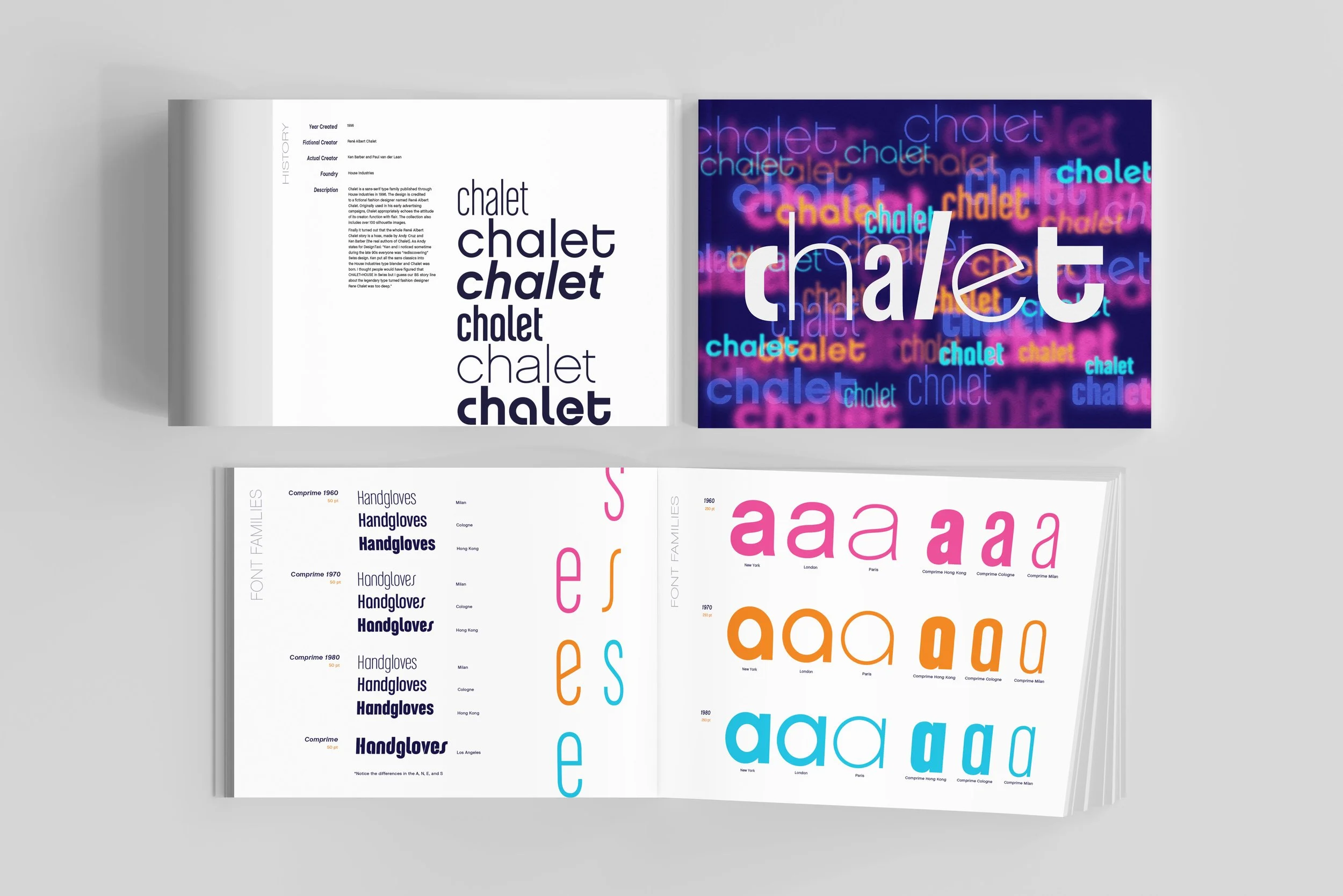
Chalet, Type Specimen, 2021
Working with the typeface Chalet, discovering it’s unique qualities, and created a type specimen book. Also, interpreting it how I see it and how it can be used along with other typefaces. I even created 4 separate pieces that go along with the book.
-

Stop, Environmental Poster, 2020
When deciding what to do for this poster, I was inspired by a photo that I saw. A photo of a turtle named Peanut. She had a 6-pack plastic ring around her shell and because of that, her shell warped. This poster is a representation of what the world is doing to itself as a result of plastic pollution.
-

Vision, Expressive Calendar, 2021
I wear glasses and nearsighted. Because of that, I was inspired and wanted to explore ideas on how to make this calendar on how people and objects see things. Each month is different in terms of ideas and composition. The calendar isn’t supposed to be read like your typical calendar.
Artist Bio
Name: Daniela Castaneda
Major: Visual Communication
As a kid, I have always enjoyed making art with my hands with whatever I could find. And it continues to be that way. I don’t want to solely rely on technology for my design work. There are so many things around us that can be used and so many things worth experimenting with. I am always driven by the thought that I have yet to create my best work yet. I always ask myself, what will I design next? Because of that, I am excited to see where life takes me after graduation.


